
Page 36 - CSS
P. 36
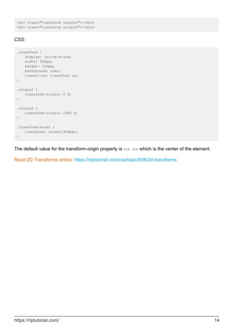
<div class="transform originl"></div>
         <div class="transform origin2"></div>


        CSS:


         .transform {
             display: inline-block;
             width: 200px;
             height: 100px;
             background: teal;
             transition: transform 1s;
         }

         .origin1 {
             transform-origin: 0 0;
         }

         .origin2 {
             transform-origin: 100% 0;
         }

         .transform:hover {
             transform: rotate(30deg);
         }


        The default value for the transform-origin property is 50% 50% which is the center of the element.

        Read 2D Transforms online: https://riptutorial.com/css/topic/938/2d-transforms


        https://riptutorial.com/                                                                               14
