
Page 41 - CSS
P. 41
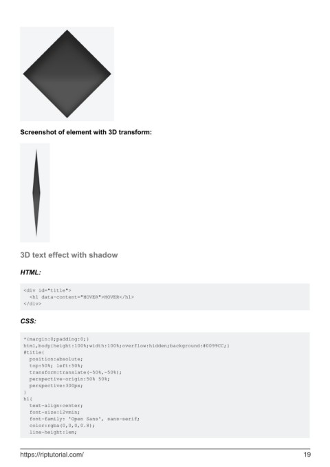
Screenshot of element with 3D transform:


        3D text effect with shadow


        HTML:


         <div id="title">
           <h1 data-content="HOVER">HOVER</h1>
         </div>


        CSS:


         *{margin:0;padding:0;}
         html,body{height:100%;width:100%;overflow:hidden;background:#0099CC;}
         #title{
           position:absolute;
           top:50%; left:50%;
           transform:translate(-50%,-50%);
           perspective-origin:50% 50%;
           perspective:300px;
         }
         h1{
           text-align:center;
           font-size:12vmin;
           font-family: 'Open Sans', sans-serif;
           color:rgba(0,0,0,0.8);
           line-height:1em;


        https://riptutorial.com/                                                                               19
