
Page 42 - CSS
P. 42
transform:rotateY(50deg);
perspective:150px;
perspective-origin:0% 50%;
}
h1:after{
content:attr(data-content);
position:absolute;
left:0;top:0;
transform-origin:50% 100%;
transform:rotateX(-90deg);
color:#0099CC;
}
#title:before{
content:'';
position:absolute;
top:-150%; left:-25%;
width:180%; height:328%;
background:rgba(255,255,255,0.7);
transform-origin: 0 100%;
transform: translatez(-200px) rotate(40deg) skewX(35deg);
border-radius:0 0 100% 0;
}
View example with additional hover effect
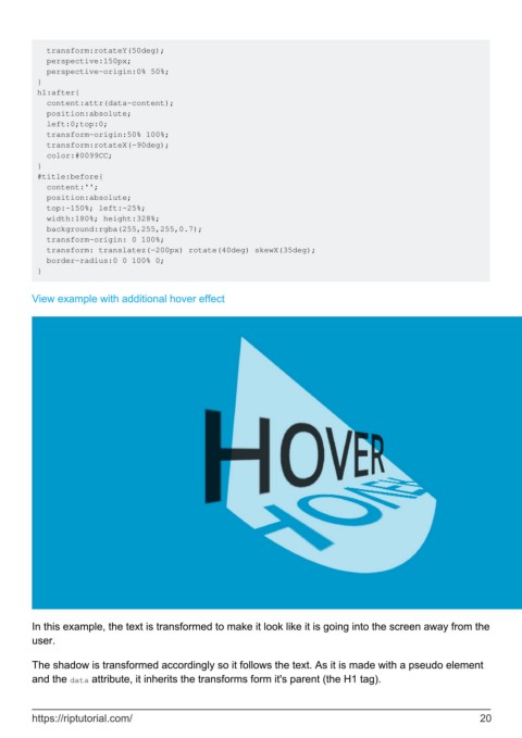
In this example, the text is transformed to make it look like it is going into the screen away from the
user.
The shadow is transformed accordingly so it follows the text. As it is made with a pseudo element
and the data attribute, it inherits the transforms form it's parent (the H1 tag).
https://riptutorial.com/ 20
