
Page 35 - CSS
P. 35
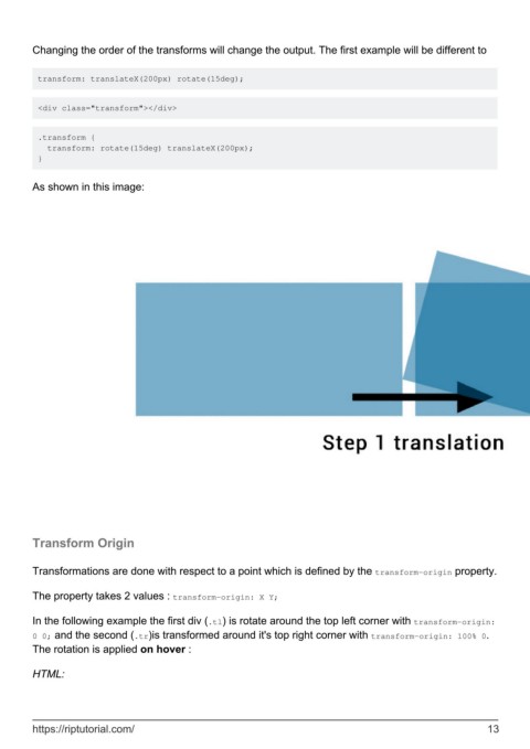
Changing the order of the transforms will change the output. The first example will be different to


         transform: translateX(200px) rotate(15deg);


         <div class="transform"></div>


         .transform {
           transform: rotate(15deg) translateX(200px);
         }


        As shown in this image:


        Transform Origin


        Transformations are done with respect to a point which is defined by the transform-origin property.

        The property takes 2 values : transform-origin: X Y;


        In the following example the first div (.tl) is rotate around the top left corner with transform-origin:
        0 0; and the second (.tr)is transformed around it's top right corner with transform-origin: 100% 0.
        The rotation is applied on hover :

        HTML:


        https://riptutorial.com/                                                                               13
