
Page 34 - CSS
P. 34
CSS
.skew {
width: 100px;
height: 100px;
background: teal;
transform: skew(20deg, -30deg);
}
This example will skew the div by 20 degrees on the X axis and by - 30 degrees on the Y axis.
The center of the transform is in the center of the div, 50% from left and 50% from top.
See the result here.
Multiple transforms
Multiple transforms can be applied to an element in one property like this:
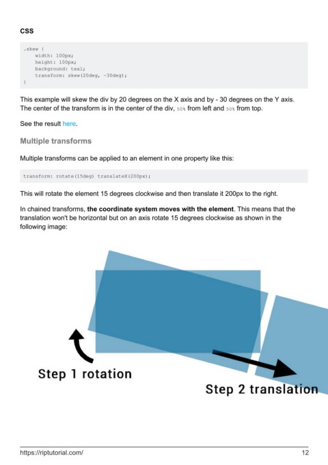
transform: rotate(15deg) translateX(200px);
This will rotate the element 15 degrees clockwise and then translate it 200px to the right.
In chained transforms, the coordinate system moves with the element. This means that the
translation won't be horizontal but on an axis rotate 15 degrees clockwise as shown in the
following image:
https://riptutorial.com/ 12
