
Page 111 - CSS
P. 111
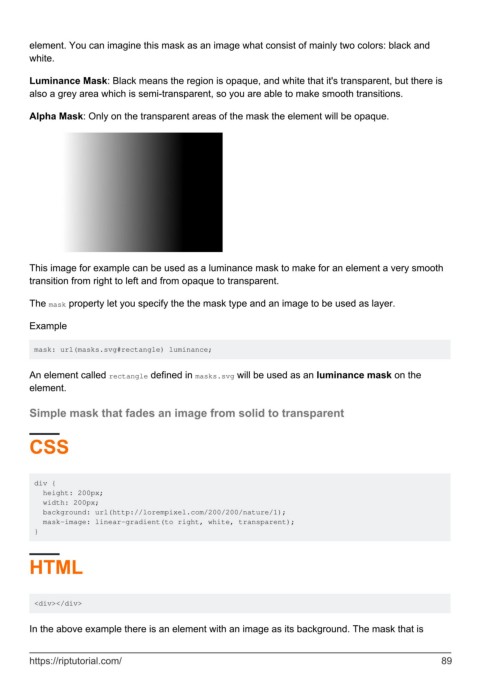
element. You can imagine this mask as an image what consist of mainly two colors: black and
        white.


        Luminance Mask: Black means the region is opaque, and white that it's transparent, but there is
        also a grey area which is semi-transparent, so you are able to make smooth transitions.

        Alpha Mask: Only on the transparent areas of the mask the element will be opaque.


        This image for example can be used as a luminance mask to make for an element a very smooth
        transition from right to left and from opaque to transparent.

        The mask property let you specify the the mask type and an image to be used as layer.


        Example


         mask: url(masks.svg#rectangle) luminance;


        An element called rectangle defined in masks.svg will be used as an luminance mask on the
        element.

        Simple mask that fades an image from solid to transparent


        CSS


         div {
           height: 200px;
           width: 200px;
           background: url(http://lorempixel.com/200/200/nature/1);
           mask-image: linear-gradient(to right, white, transparent);
         }


        HTML


         <div></div>


        In the above example there is an element with an image as its background. The mask that is


        https://riptutorial.com/                                                                               89
