
Page 113 - CSS
P. 113
HTML
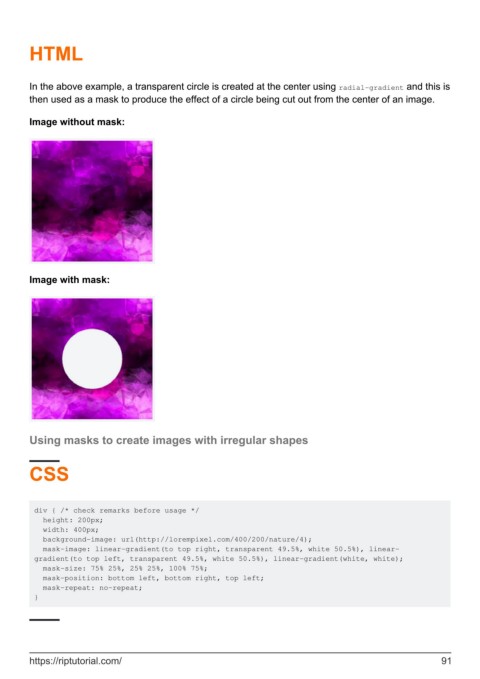
In the above example, a transparent circle is created at the center using radial-gradient and this is
then used as a mask to produce the effect of a circle being cut out from the center of an image.
Image without mask:
Image with mask:
Using masks to create images with irregular shapes
CSS
div { /* check remarks before usage */
height: 200px;
width: 400px;
background-image: url(http://lorempixel.com/400/200/nature/4);
mask-image: linear-gradient(to top right, transparent 49.5%, white 50.5%), linear-
gradient(to top left, transparent 49.5%, white 50.5%), linear-gradient(white, white);
mask-size: 75% 25%, 25% 25%, 100% 75%;
mask-position: bottom left, bottom right, top left;
mask-repeat: no-repeat;
}
https://riptutorial.com/ 91
