
Page 68 - CSS
P. 68
<div>
<div class="contain"></div>
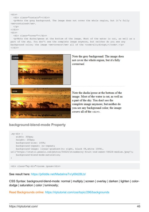
<p>Note the grey background. The image does not cover the whole region, but it's fully
<em>contained</em>.
</p>
</div>
<div>
<div class="cover"></div>
<p>Note the ducks/geese at the bottom of the image. Most of the water is cut, as well as a
part of the sky. You don't see the complete image anymore, but neither do you see any
background color; the image <em>covers</em> all of the <code><div></code>.</p>
</div>
background-blend-mode Property
.my-div {
width: 300px;
height: 200px;
background-size: 100%;
background-repeat: no-repeat;
background-image: linear-gradient(to right, black 0%,white 100%),
url('https://static.pexels.com/photos/54624/strawberry-fruit-red-sweet-54624-medium.jpeg');
background-blend-mode:saturation;
}
<div class="my-div">Lorem ipsum</div>
See result here: https://jsfiddle.net/MadalinaTn/y69d28Lb/
CSS Syntax: background-blend-mode: normal | multiply | screen | overlay | darken | lighten | color-
dodge | saturation | color | luminosity;
Read Backgrounds online: https://riptutorial.com/css/topic/296/backgrounds
https://riptutorial.com/ 46
