
Page 152 - CSS
P. 152
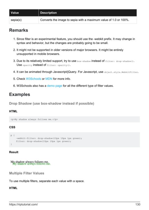
Value                  Description

          sepia(x)               Converts the image to sepia with a maximum value of 1.0 or 100%.


        Remarks


            1.  Since filter is an experimental feature, you should use the -webkit prefix. It may change in
              syntax and behavior, but the changes are probably going to be small.

            2.  It might not be supported in older versions of major browsers. It might be entirely
              unsupported in mobile browsers.


            3.  Due to its relatively limited support, try to use box-shadow instead of filter: drop-shadow().
              Use opacity instead of filter: opacity().

            4.  It can be animated through Javascript/jQuery. For Javascript, use object.style.WebkitFilter.


            5.  Check W3Schools or MDN for more info.

            6.  W3Schools also has a demo page for all the different type of filter values.


        Examples


        Drop Shadow (use box-shadow instead if possible)


        HTML


         <p>My shadow always follows me.</p>


        CSS


         p {
             -webkit-filter: drop-shadow(10px 10px 1px green);
             filter: drop-shadow(10px 10px 1px green);
         }


        Result


        Multiple Filter Values


        To use multiple filters, separate each value with a space.


        HTML


        https://riptutorial.com/                                                                             130
