
Page 151 - CSS
P. 151
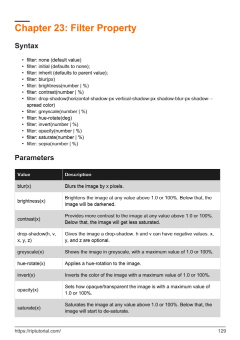
Chapter 23: Filter Property


        Syntax


            •  filter: none (default value)
            •  filter: initial (defaults to none);
            •  filter: inherit (defaults to parent value);
            •  filter: blur(px)
            •  filter: brightness(number | %)
            •  filter: contrast(number | %)
            •  filter: drop-shadow(horizontal-shadow-px vertical-shadow-px shadow-blur-px shadow- -
              spread color)
            •  filter: greyscale(number | %)
            •  filter: hue-rotate(deg)
            •  filter: invert(number | %)
            •  filter: opacity(number | %)
            •  filter: saturate(number | %)
            •  filter: sepia(number | %)


        Parameters


          Value                  Description

          blur(x)                Blurs the image by x pixels.


                                 Brightens the image at any value above 1.0 or 100%. Below that, the
          brightness(x)
                                 image will be darkened.

                                 Provides more contrast to the image at any value above 1.0 or 100%.
          contrast(x)
                                 Below that, the image will get less saturated.


          drop-shadow(h, v,      Gives the image a drop-shadow. h and v can have negative values. x,
          x, y, z)               y, and z are optional.

          greyscale(x)           Shows the image in greyscale, with a maximum value of 1.0 or 100%.


          hue-rotate(x)          Applies a hue-rotation to the image.


          invert(x)              Inverts the color of the image with a maximum value of 1.0 or 100%.

                                 Sets how opaque/transparent the image is with a maximum value of
          opacity(x)
                                 1.0 or 100%.


                                 Saturates the image at any value above 1.0 or 100%. Below that, the
          saturate(x)
                                 image will start to de-saturate.


        https://riptutorial.com/                                                                             129
