
Page 147 - CSS
P. 147
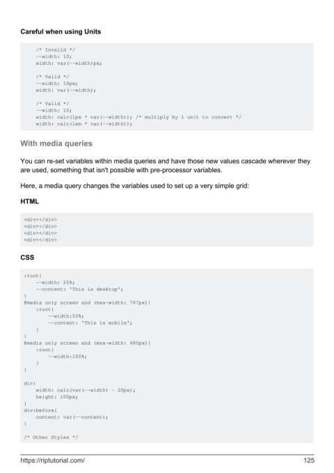
Careful when using Units


             /* Invalid */
             --width: 10;
             width: var(--width)px;

             /* Valid */
             --width: 10px;
             width: var(--width);

             /* Valid */
             --width: 10;
             width: calc(1px * var(--width)); /* multiply by 1 unit to convert */
             width: calc(1em * var(--width));


        With media queries


        You can re-set variables within media queries and have those new values cascade wherever they
        are used, something that isn't possible with pre-processor variables.


        Here, a media query changes the variables used to set up a very simple grid:

        HTML


         <div></div>
         <div></div>
         <div></div>
         <div></div>


        CSS


         :root{
             --width: 25%;
             --content: 'This is desktop';
         }
         @media only screen and (max-width: 767px){
             :root{
                 --width:50%;
                 --content: 'This is mobile';
             }
         }
         @media only screen and (max-width: 480px){
             :root{
                 --width:100%;
             }
         }

         div{
             width: calc(var(--width) - 20px);
             height: 100px;
         }
         div:before{
             content: var(--content);
         }

         /* Other Styles */


        https://riptutorial.com/                                                                             125
