
Page 54 - CSS
P. 54
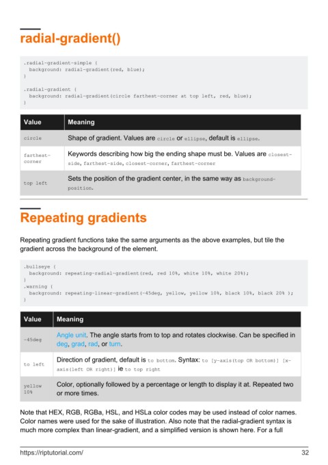
radial-gradient()


         .radial-gradient-simple {
           background: radial-gradient(red, blue);
         }

         .radial-gradient {
           background: radial-gradient(circle farthest-corner at top left, red, blue);
         }


          Value           Meaning


          circle          Shape of gradient. Values are circle or ellipse, default is ellipse.

          farthest-       Keywords describing how big the ending shape must be. Values are closest-
          corner          side, farthest-side, closest-corner, farthest-corner


                          Sets the position of the gradient center, in the same way as background-
          top left
                          position.


        Repeating gradients


        Repeating gradient functions take the same arguments as the above examples, but tile the
        gradient across the background of the element.


         .bullseye {
           background: repeating-radial-gradient(red, red 10%, white 10%, white 20%);
         }
         .warning {
           background: repeating-linear-gradient(-45deg, yellow, yellow 10%, black 10%, black 20% );
         }


          Value       Meaning

                      Angle unit. The angle starts from to top and rotates clockwise. Can be specified in
          -45deg
                      deg, grad, rad, or turn.


                      Direction of gradient, default is to bottom. Syntax: to [y-axis(top OR bottom)] [x-
          to left
                      axis(left OR right)] ie to top right


          yellow      Color, optionally followed by a percentage or length to display it at. Repeated two
          10%         or more times.


        Note that HEX, RGB, RGBa, HSL, and HSLa color codes may be used instead of color names.
        Color names were used for the sake of illustration. Also note that the radial-gradient syntax is
        much more complex than linear-gradient, and a simplified version is shown here. For a full


        https://riptutorial.com/                                                                               32
