
Page 53 - CSS
P. 53
Background Gradients
Gradients are new image types, added in CSS3. As an image, gradients are set with the
background-image property, or the background shorthand.
There are two types of gradient functions, linear and radial. Each type has a non-repeating variant
and a repeating variant:
• linear-gradient()
• repeating-linear-gradient()
• radial-gradient()
• repeating-radial-gradient()
linear-gradient()
A linear-gradient has the following syntax
background: linear-gradient( <direction>?, <color-stop-1>, <color-stop-2>, ...);
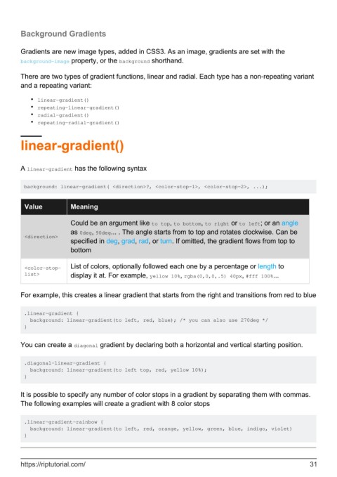
Value Meaning
Could be an argument like to top, to bottom, to right or to left; or an angle
as 0deg, 90deg... . The angle starts from to top and rotates clockwise. Can be
<direction>
specified in deg, grad, rad, or turn. If omitted, the gradient flows from top to
bottom
<color-stop- List of colors, optionally followed each one by a percentage or length to
list> display it at. For example, yellow 10%, rgba(0,0,0,.5) 40px, #fff 100%...
For example, this creates a linear gradient that starts from the right and transitions from red to blue
.linear-gradient {
background: linear-gradient(to left, red, blue); /* you can also use 270deg */
}
You can create a diagonal gradient by declaring both a horizontal and vertical starting position.
.diagonal-linear-gradient {
background: linear-gradient(to left top, red, yellow 10%);
}
It is possible to specify any number of color stops in a gradient by separating them with commas.
The following examples will create a gradient with 8 color stops
.linear-gradient-rainbow {
background: linear-gradient(to left, red, orange, yellow, green, blue, indigo, violet)
}
https://riptutorial.com/ 31
