
Page 199 - CSS
P. 199
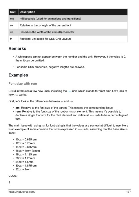
Unit    Description

          ms      milliseconds (used for animations and transitions)


          ex      Relative to the x-height of the current font

          ch      Based on the width of the zero (0) character


          fr      fractional unit (used for CSS Grid Layout)


        Remarks


            •  A whitespace cannot appear between the number and the unit. However, if the value is 0,
              the unit can be omitted.

            •  For some CSS properties, negative lengths are allowed.


        Examples


        Font size with rem


        CSS3 introduces a few new units, including the rem unit, which stands for "root em". Let's look at
        how rem works.


        First, let's look at the differences between em and rem.

            •  em: Relative to the font size of the parent. This causes the compounding issue
            •  rem: Relative to the font size of the root or <html> element. This means it's possible to
              declare a single font size for the html element and define all rem units to be a percentage of
              that.

        The main issue with using rem for font sizing is that the values are somewhat difficult to use. Here
        is an example of some common font sizes expressed in rem units, assuming that the base size is
        16px :


            •  10px = 0.625rem
            •  12px = 0.75rem
            •  14px = 0.875rem
            •  16px = 1rem (base)
            •  18px = 1.125rem
            •  20px = 1.25rem
            •  24px = 1.5rem
            •  30px = 1.875rem
            •  32px = 2rem


        CODE:

        3


        https://riptutorial.com/                                                                             177
