
Page 169 - CSS
P. 169
Fewer <br />
lines <br />
</div>
</div>
CSS
.container {
display: flex;
align-items: stretch; // Default value
}
Note: Does not work on IE versions under 10
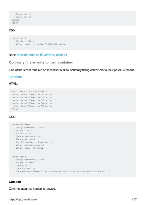
Optimally fit elements to their container
One of the nicest features of flexbox is to allow optimally fitting containers to their parent element.
Live demo.
HTML:
<div class="flex-container">
<div class="flex-item">1</div>
<div class="flex-item">2</div>
<div class="flex-item">3</div>
<div class="flex-item">4</div>
<div class="flex-item">5</div>
</div>
CSS:
.flex-container {
background-color: #000;
height: 100%;
display:flex;
flex-direction: row;
flex-wrap: wrap;
justify-content: flex-start;
align-content: stretch;
align-items: stretch;
}
.flex-item {
background-color: #ccf;
margin: 0.1em;
flex-grow: 1;
flex-shrink: 0;
flex-basis: 200px; /* or % could be used to ensure a specific layout */
}
Outcome:
Columns adapt as screen is resized.
https://riptutorial.com/ 147
